I Don’t Get Drunk, I Get Awesome
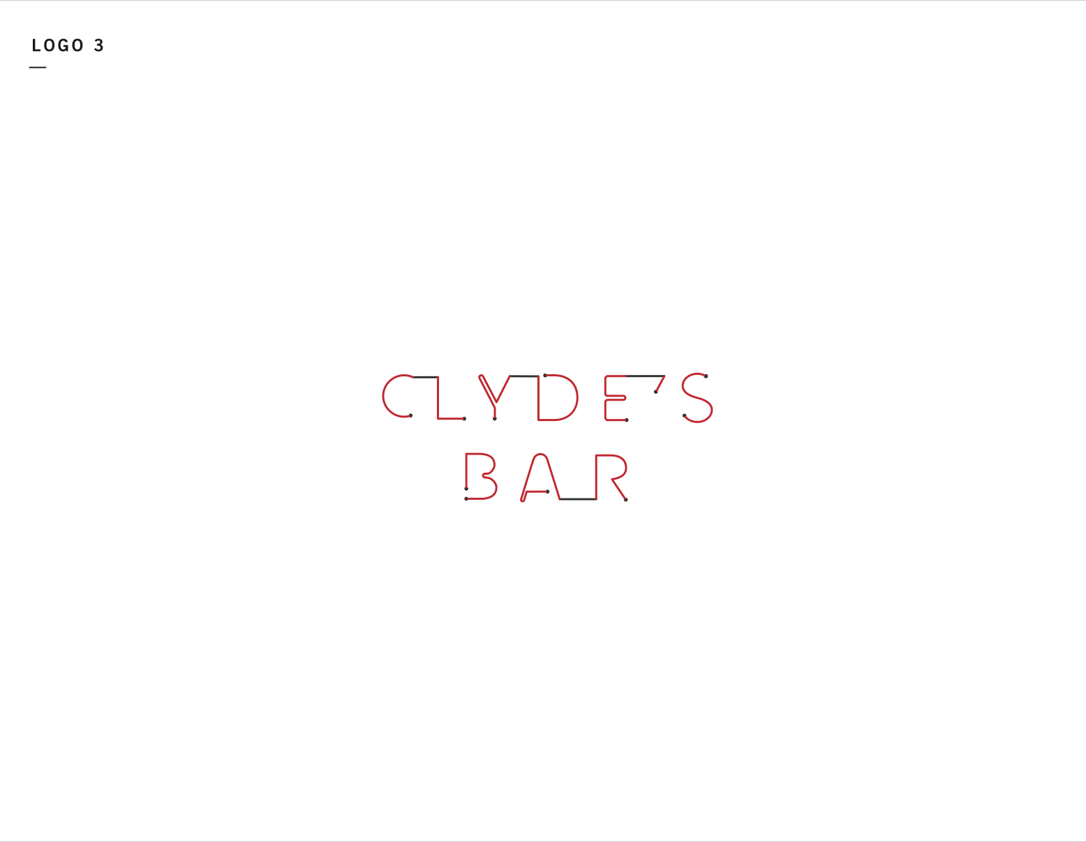
Clyde’s On Main Logo
Mike & Taylor Monen and Tenley Mayfield are experienced restaurateurs — creating successful establishments like Taco Mamacita, Urban Stack, Community Pie and Milk & Honey. As they moved towards opening their fifth concept restaurant, Clyde’s On Main, they asked Widgets & Stone to help with logo design and other graphic needs.
Since Clyde’s was designed to be a “go-to” spot for locals, it made sense to name it after something the neighborhood would recognize — the building and business formerly known as Clyde’s Auto Glass. The auto glass sign painted on the wall of the building was iconic, and known to everyone in the area, so Widgets & Stone decided to base the logo on it.
The overall aesthetic of Clyde’s is reminiscent of the 1980’s and is a hodgepodge of relatively undesigned stuff, so the Widgets team (of Ben Dicks and Travis Hitchcock) created a very simple logo system. In short, Clyde’s logos are simply built to be flexible to whatever suits the medium of production. Flat bold art for painted signs, outlined lettering for rubber stamps, simplified letterforms for neon, and so forth.
The result is an interchangeable system of logos that is a unified family, but with distinct personalities — including that drunk uncle.
Creative Direction: Paul Rustand; Design: Ben Dicks, Travis Hitchcock.


