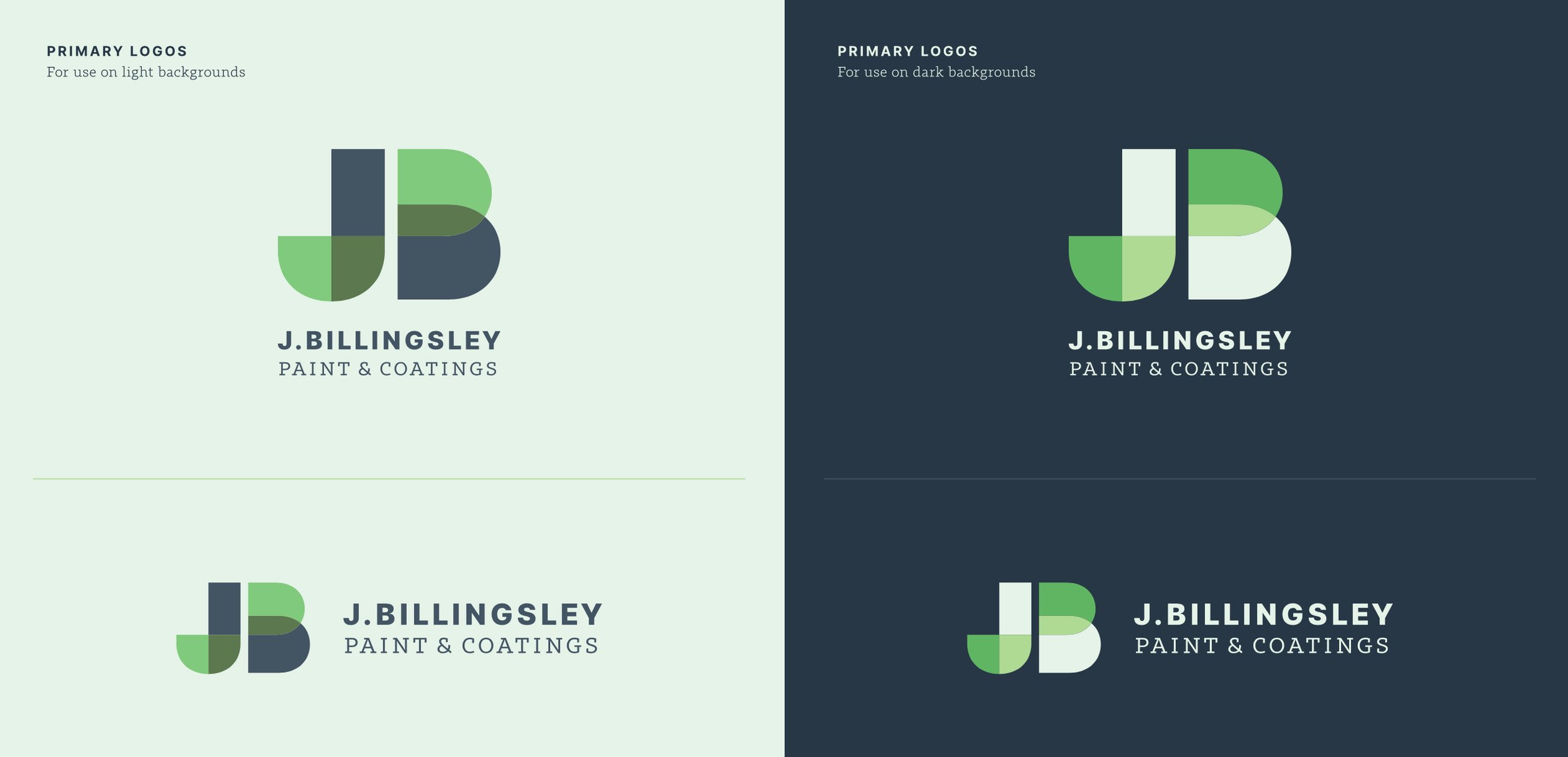
A Perfect Overlap
J. Billingsley Paint & Coatings Logo
Jacob and Sara Billingsley are striking out on their own after many years of experience in commercial paint and coating services. The new company will focus on residential projects.
They wanted to stay away from tired or trite references to painting—paint brush imagery, rollers, cans etc. Our Senior Designer, Mark Walter, decided that a more subtle or abstract reference to paints and coatings – coupled with the use of a monogram – focuses on the professionals at the core of the business. The result helps to differentiate them from your run-of-the mill local house painting business.
Mark wanted the type choices and implementation to lend a sort of blue-collar, hardworking tradesman, no-nonsense tone. On a design-related note: color transparency experiments that play into the final color palette were inspired by Josef Albers. It’s an interesting connection that a lot of his color theory work was essentially cutting and arranging paint swatches!
Creative Direction: Paul Rustand; Design: Mark Walter.


