• About
  • WHITEBOARD
  • Archive
  • Contact
Menu

widgets & stone | Graphic Design and Branding Agency in Chattanooga, TN

  • About
  • WHITEBOARD
  • Archive
  • Contact

Eat Here Now

June 3, 2025

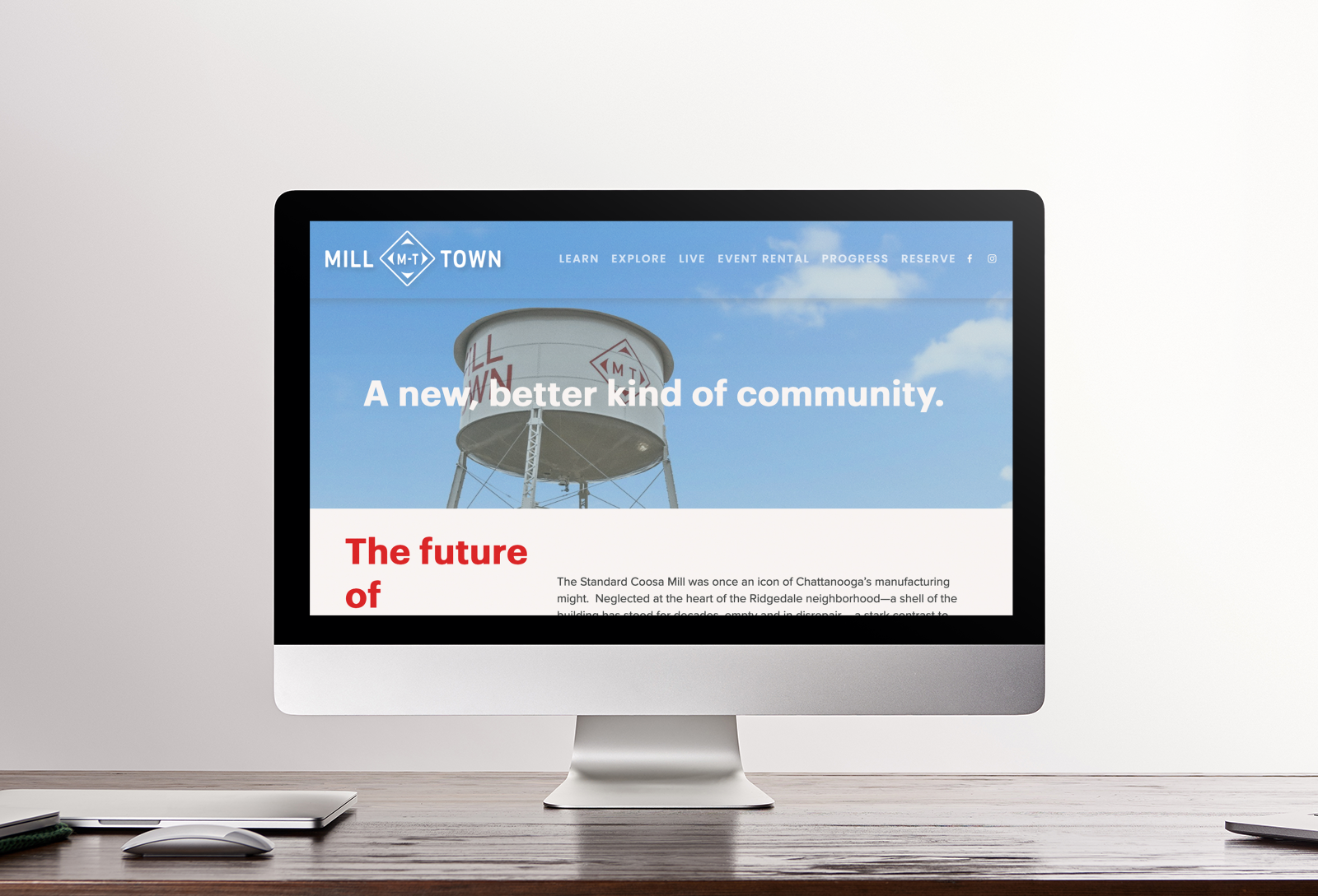
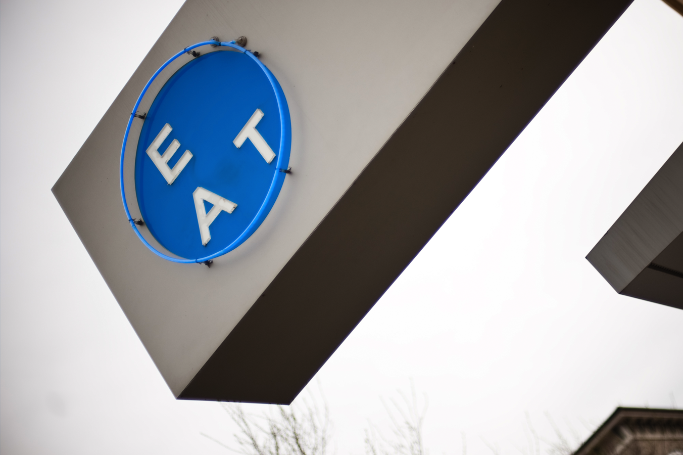
After years of experience with Big River Grille, restaurateur Rob Gentry decided to open up The Blue Plate – a modern take on a traditional diner. The fresh and creative menu was complemented by the sleek contemporary interiors designed by architect Roddy Creedon of Allied Architecture. Our team was tasked with developing a logo and identity design that captured the spirit of the place and the food.

View fullsize blueplate200903-065-(3) copy.jpg
View fullsize SignsAtNight.jpg
View fullsize BP-Sign1.jpg

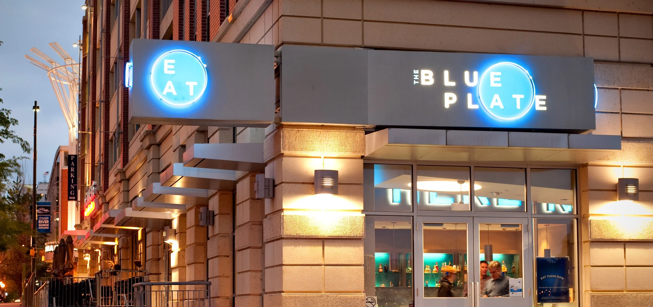
Over a period 15 years we created brand design and marketing tools for Chattanooga’s metropolitan diner. As the restaurant grew and changed over the years, so did the branding. Our team designed strategies and messaging for digital, print, photography, interior design and so much more.

View fullsize blueplate-4.jpg
View fullsize Menu-Orig-Detail.jpg
View fullsize blueplate-5.jpg
View fullsize blueplate-9.jpg
View fullsize EAT-Coasters.jpg
View fullsize IMG_0428.JPG
View fullsize BPMenu copy.jpg
View fullsize IMG_0433.JPG
View fullsize blueplate-7.jpg

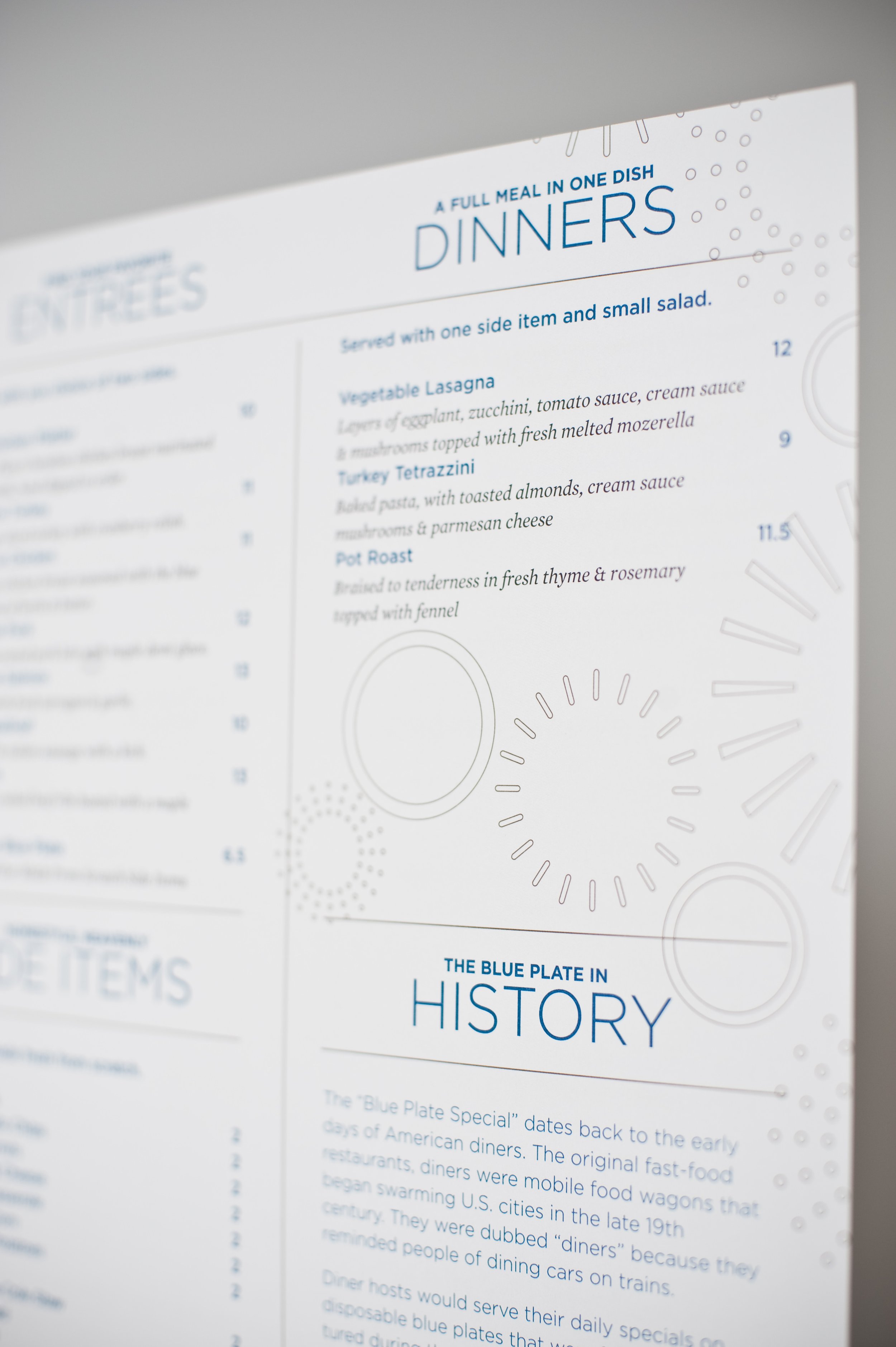
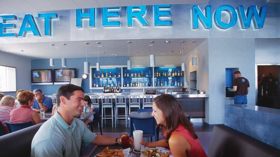
Early designs leaned heavily on typography, creating layouts that brought to mind neon signs, city streets, wax paper and diner marquees. When great photography of the food and drinks became available, they became part of the design language of the brand.

View fullsize FOOD-OJ.jpg
View fullsize FOOD-BleuChips.jpg
View fullsize FOOD-Coffee.jpg
View fullsize FOOD-BBPancake.jpg
View fullsize FOOD-TacoMenu.jpg

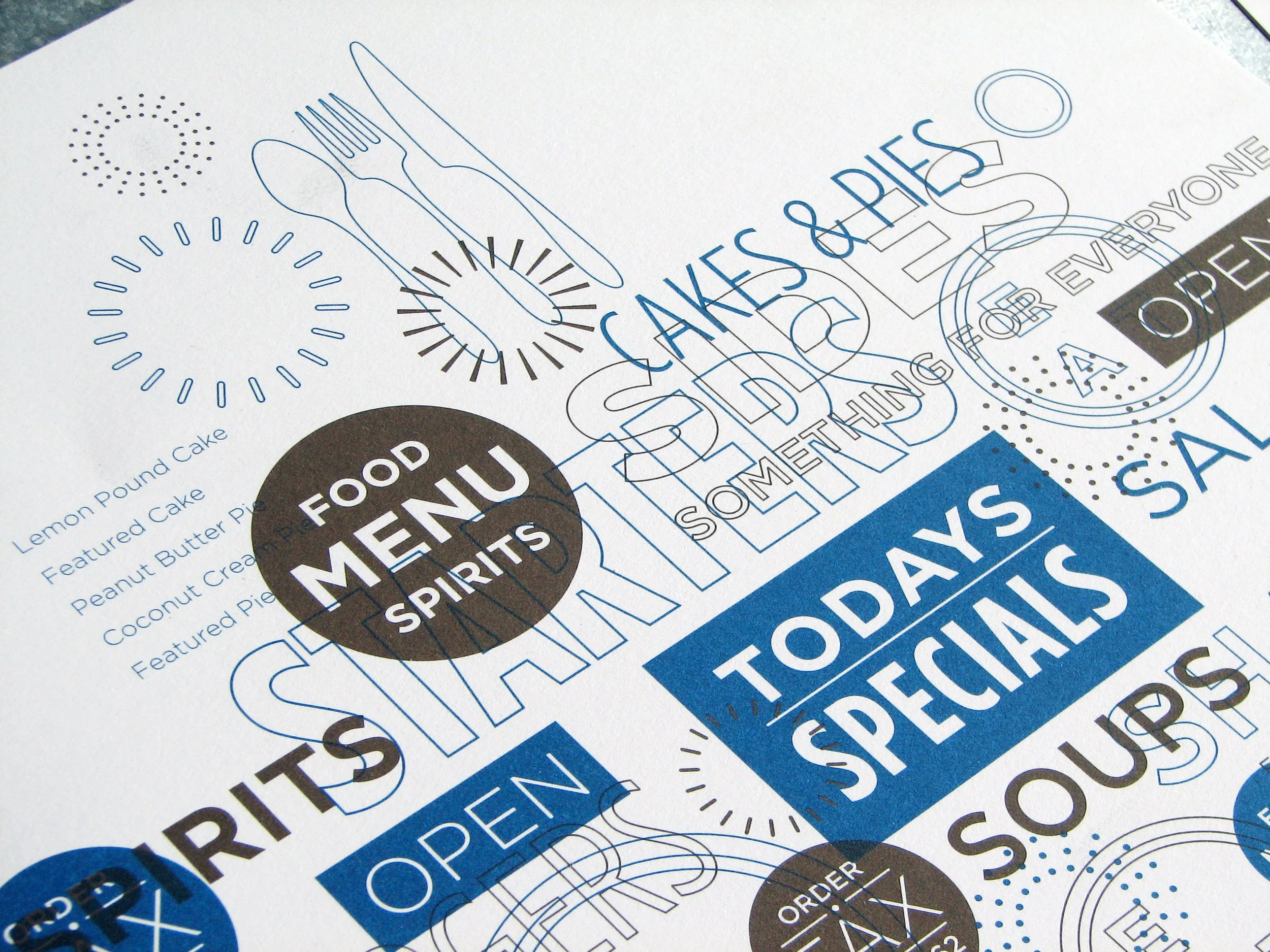
In later years, the designs evolved to a condensed version of the type on flat color with halftone patterns, always paired short and clever writing. This style followed the relaunch of The Blue Plate’s bar as a separate, sister establishment: Local 191. It used similar type and half tones, but with complimentary colors.

View fullsize BP-Shuttle-Enjoy+Front.jpg
View fullsize Web-Top.jpg
View fullsize WebOniPhone.jpg
View fullsize WebBottom.jpg
View fullsize MenuCover-Modern.jpg
View fullsize 2013-07-10 13.42.33 HDR.jpg
View fullsize MenuInside-Modern.jpg
View fullsize EatHereNow-SandwichBoard.jpg
View fullsize BP-Shuttle-BACK.jpg

Creative Direction: Paul Rustand; Design: Brad Dicharry, Joseph Shipp, Travis Hitchcock, Mark Slawson, Liz Tapp, Stephanie Fast; Photography: Grant Dotson, Graham Yelton; Writing: Caleb Ludwick.

Tags The Blue Plate, Brand design, environmental graphics, signage design, ad design, Identity Design

Start Your Ascent

October 12, 2022
View fullsize H3LIUM_brandguide-02.jpg
View fullsize H3LIUM_brandguide-04.jpg
View fullsize H3LIUM_brandguide-08.jpg
View fullsize H3LIUM_brandguide-07.jpg
View fullsize H3LIUM_brandguide-16.jpg
View fullsize H3LIUM_brandguide-13.jpg
View fullsize H3LIUM_brandguide-24.jpg
View fullsize H3LIUM_brandguide-20.jpg

Start Your Ascent

H3LIUM Brand Design

H3LIUM is a Web3 native company with the mission of onboarding new builders and companies into the ecosystem to pursue unique fundraising opportunities — through creative services and unparalleled industry expertise. H3LIUM Studio is a full service creative agency with leading industry expertise in all things web3. Their team provides the highest quality creative offerings through in-house talent and represented artists.

The H3LIUM platform was the brainchild of the creators of the Balloonsville NFT collection. They saw great potential in expanding the types of collections they offered, as well as growing out their suite of services for others seeking to get into the sometimes confusing world of NFTs.

We helped guide them through the process of creating, naming and branding a new umbrella company that could house all the different kinds of products and services they were offering, and would offer in the future.

When it came to the design solution, our team thought a lot about the metaphor of flexibility or malleability — things being shape-shifting, scalable, adaptable. People who are interested in Web3 seem to have a shared interest in products and projects that are multidimensional and hard to categorize. They seem to fit whatever space is needed, much like the gas of Helium. The extreme thins and thicks in the type family embody this as well.

The final result is a design that embraces freedom and exploration, pushing boundaries to see what the worldwide web can actually be.

Creative Director: Paul Rustand; Art Director: Mark Walter; Designer: Noah Marlowe.

Tags NFT, Brand design, logo system, Identity Design, H3LIUM, Widgets & Stone

Not Your Run of the Mill

June 6, 2022
View fullsize MT-LogoBoard.jpg
View fullsize MT-SCT-Original.jpg
View fullsize CM-Logos.jpg

Not Your Run of the Mill

Brand design for Mill Town

The Standard Coosa Mill was once an icon of Chattanooga’s manufacturing might. Neglected at the heart of the Ridgedale neighborhood—a shell of the building has stood for decades, empty and in disrepair— a stark contrast to Chattanooga’s celebrated city center just two miles North East.

Benwood, Chattanooga Neighborhood Enterprise, and Collier Construction have formed a partnership that will soon revitalize this abandoned 20-acre parcel. Through a sustainable redevelopment model, Milltown will deliver a unique Mixed-Use and Multi-family community—boasting contemporary office space, ground-floor retail and dining, coffee, single family stand-alone homes and townhouses, community center, public plaza, green space, and more.

With a long history of partnering with Collier Construction, Matt Greenwell led the project to help name and brand the new development. The history of the place and the buildings helped provide inspiration both names — Mill Town for the development, Coosa Mill for the redesign of the factory — as well as for the design. The diamond shape of the now defunct Standard Coosa Thatcher Mill provided the foundation of the Mill Town mark. Bright bold colors and typography were selected to stand out in the environment.

Along with all the new homes being built in the Mill Town development is the anchor structure of the old factory, Coosa Mill. The refurbished water tower provided the inspiration for the abstracted enclosure of the Coosa Mill logo, which mirrors the geometry of the Mill Town logo.

While very much still a work in progress, the Mill Town identity is slowly beginning to take shape. Signage, wayfinding, promotion and web design are helping to build this new and exciting development in the heart of the city.

Learn more about Mill Town here.

Creative Direction: Paul Rustand; Design Direction: Matt Greenwell; Design: Matt Greenwell, Mark Slawson, Emily Ricks, Liz Tapp, Noah Marlowe.

Tags Widgets & Stone, Identity Design, brand identity, collier construction, development, Mill Town, Coosa Mill, Chattanooga TN

Telling Stories that Matter

April 26, 2022
View fullsize Chattamatters-09.png
View fullsize Chattamatters-10.png
View fullsize Chattamatters-11.png
View fullsize Chattamatters-12.png

Stories that Matter

Chattamatters Visual Identity

Chattamatters is a brand new project from The Enterprise Center in partnership with The City of Chattanooga. Civic Storytelling Director, Mary Helen Montgomery, and Videographer & Motion Graphics Producer, Ian-Alijah Bey, have teamed up to lead the project. Pitched as a civic storytelling initiative, Chattamatters aims to "promote civic engagement and help residents understand some of the biggest issues facing our community (and how to address them)".


We worked with the Chattamatters team to design a visual identity that is bold and optimistic in tone, straightforward and approachable in execution. The visual strategy is meant to center the content and not the brand—to unite the series of stories with a cohesive aesthetic that does not complicate the user's experience.

Creative Direction: Paul Rustand, Design Direction & Design: Mark Walter.

Tags logo, logo system, visual identity, Identity Design, Widgets & Stone, Chattanooga

Plan, Manage, Build.

October 15, 2021

Plan, Manage, Build.

Tucker Build Identity

Tucker build is a commercial construction team, made up of design-build specialists. They know every project is unique, and that's why they break the mold again and again for their clients. Tucker Build’s expertise is in bespoke planning, managing, and building. Their process is defined by the specifics of each project and their job is to think of everything.

Since Widgets & Stone works in a very similar way in brand and identity design, we were a perfect fit to bring out the essence of Tucker Build in design applications. The dynamic and strong lettermark connotes movement and growth, while the practical stencil design reflects the down-to-earth, strong work ethic of the company.

Creative Direction: Paul Rustand; Design: Brad Dicharry, Mark Slawson; Web design + photography: Casey Yoshida.

Tags Tucker Build, design build, specialists, construction, builders, Widgets & Stone, logo design, Identity Design

Latest Posts

1433 Williams Street, Chattanooga, TN 37408
+1 423-266-2221    info@widgetsandstone.com
A Whiteboard Company