Refreshing the Body
Design update for Lookout Mountain Presbyterian Church
In 2015 designer Benjamin Dicks (formerly a designer with Widgets & Stone from 2012-2014) created an elegant identity design for Lookout Mountain Presbyterian Church (LMPC). The design served the church well for over six years.
In 2021 LMPC Communications Director Anna Moyle asked us to “refresh” the identity and provide design tools for the church’s communication needs. We kept the rose window symbol Ben created, but updated the type and colors and provided an alternate approach – reversing the symbol out of a solid circle.
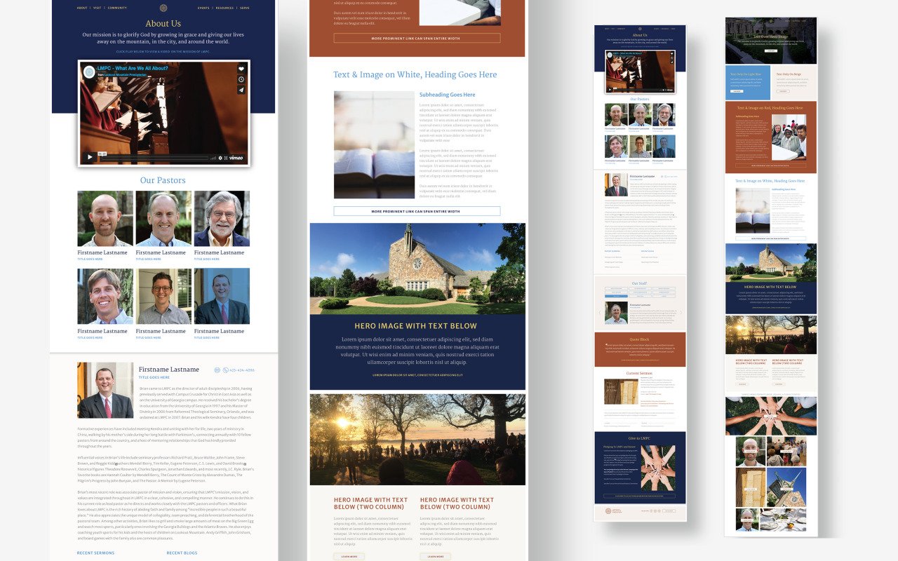
The design team then updated the look and feel of stationery, documents, brochures, TV displays, and podcast graphics along with customizing an icon set. We also worked with web developer John Reeder to provide a wide array of web module design and styles to be applied to the new web site (which is currently in development). Lastly, we provided the working templates with design guidelines to help the communications team implement the new look.
Creative Direction: Paul Rustand; Art Direction: Mark Walter; Design: Brad Dicharry, Emily Ricks, Mark Walter, Noah Marlowe; Photography: LMPC.


