Mama Knows Best
A Rebrand for Taco Mamacita
The very first restaurant Mike and Taylor Monen opened together was Taco Mamacita on Chattanooga’s North Shore in 2008. It quickly became city staple and a local favorite. In the years that followed, the couple created at least eight more concepts — adding a brewery and a music hall to their restaurants — with just as many locations. Along the way, the Monens began to expand their concepts to other cities, including a Taco Mamacita in Nashville in 2009.
After a great stint in the southwest area of Nashville, an opportunity arose in 2020 to move to a thriving section of the city known as Germantown. The historic building of Little’s Fish Market would become the new home of Taco Mamacita.
The Monens seized on the opportunity to expand and re-imagine the Taco Mamacita brand, enlisting Smith Hanes (interior design) and Dryden Architecture & Design to bring out the very best in the new space and location. Soon after, Widgets & Stone joined the effort to assist in rebranding Taco Mamacita for its next era. The Widgets team was privileged to collaborate design of the new space, creating concepts for signage, murals, posters, merchandise, menus and more.
The Brand Design
The Monens originally tasked Widgets & Stone with creating a new look and feel for the Taco Mamacita brand that bridged where they had been with where they were going. The creative team generated a variety of designs that highlighted various aspects of the Taco Mama personality. The winning design style for the logo was the one that seemed to fit best with the clean aesthetic of the building and interior designs. It was also based on the original marquee sign lettering still adorns the first location.
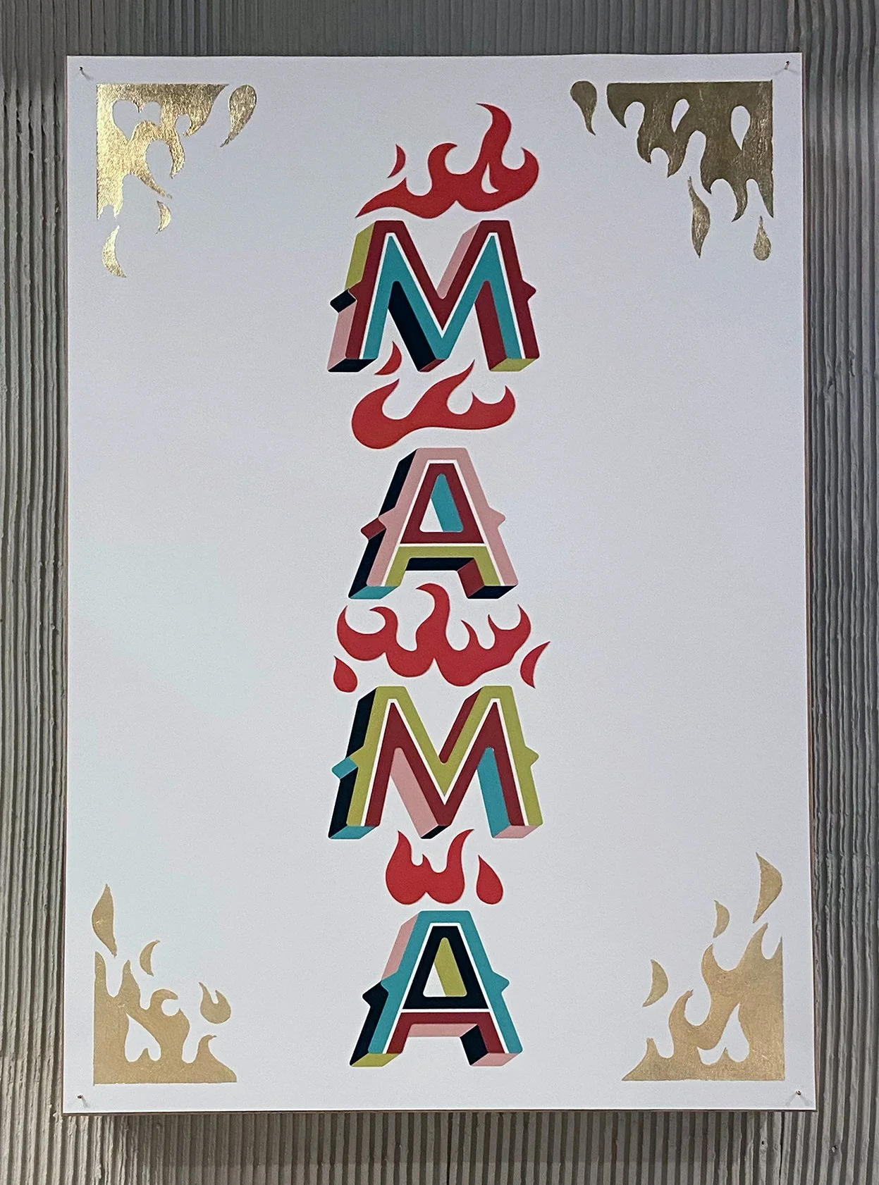
From there the creative team began to build out graphics for the restaurant space. After reviewing the clean and minimal design results, the Monens asked if Widgets & Stone could inject a little more of the gritty humor and “rock’n’roll aesthetic” that the original store had. The team was happy to oblige — and under the guidance of Art Director Mark Walter, the final results effectively captured that “Taco Mama” spirit.
Art of the Craft
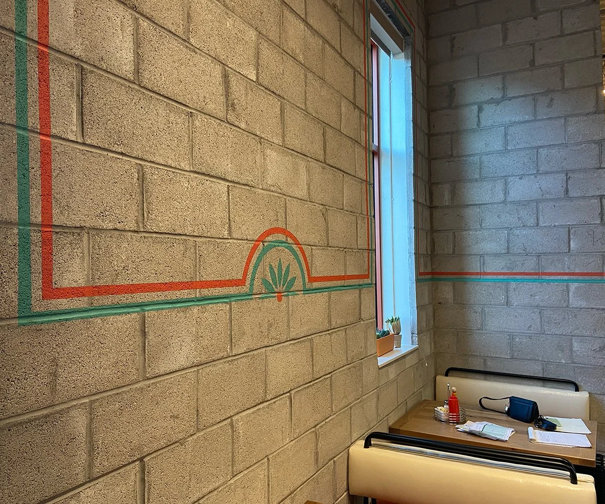
Finally, to bring the vision of the graphics to life in the space, Taylor Monen asked the talented sign painters of I Saw the Sign in Nashville to paint all the designs in the restaurant, exterior and interior. Mark Walter provided design direction for the most prominent design elements, but the allowed for I Saw the Sign to showcase their immense talents with places for original touches on type, flourishes and ornamentation. Not to be outdone, Mark added his own personal touch to the six poster designs with handpainted elements, gold foil and cut paper additions.
The result is a warm, charmingly imperfect, but thoroughly vibrant human touch that is Taco Mamacita.
Creative Direction: Paul Rustand; Art Direction: Liz Tapp, Mark Walter; Design: Mark Walter, Emily Ricks; Interior Design: Smith Hanes; Architecture: Dryden; Sign Painting: I Saw the Sign; Photography where noted: Quinn Ballard.


